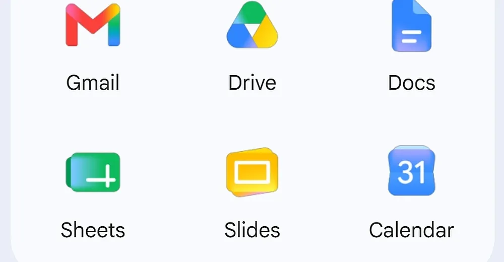
It's not just you - the Google Workspace apps are getting a new look. The redesigned app icons, leaked last month, are now rolling out widely, as we started noticing this morning. Users with the redesigned icons will notice they now have a gradient look that fades from lighter to darker shades, rather than being the same flat tone throughout, similar to the redesigned Google logo that launched a year ago. Some of the icons switched from a rainbow design to a single color, like Google Chat, Meet, and Calendar, which could help all of the icons stand out a bit more from one another - or make them harder to recognize. Others haven't changed a … Read the full story at The Verge.
Source: https://www.theverge.com/tech/932417/google-gmail-docs-cal-sheets-workspace-icon-redesign
Tech
Google is rolling out its redesigned Workspace app icons
Article Top Ad Zone
Article Middle Ad Zone
Article Bottom Ad Zone
Original Source: www.theverge.com
Share
Comments
Comment system is currently disabled.